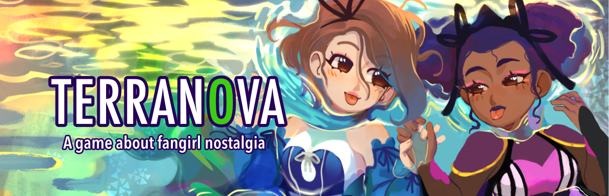
Terranova
UI Polish
Terranova has come a long way from its humble origins as a 48 hour game jam project. In addition to fleshing out the story and characters, we've also been hard at work building out the user interface.
Today I want to talk about some of the subtle UI details I've been working on. I feel like these sorts of things are easy to overlook, but are important to making a game feel more professional. Some of these improvements are already in the latest version (alpha 3), the rest will be part of the next release.
Visual Effects
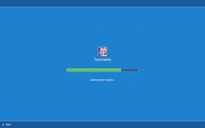
One of the places I added some extra vfx magic was in the browser when you load a new blog. Credit where its due: this progressive-rendering effect is directly inspired by the game Simulacra 2.
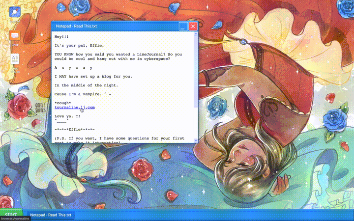
We decided on this effect not for the sake of being flashy, but because it reinforces the setting. Also, this effect only shows when you access a new blog for the first time, rather than on every single page. It proved to be too annoying otherwise. I think it's easy to go overboard when adding effects, and end up overwhelming or distracting the player. A light touch is best.
This was also a case where we opted for being evocative rather than 100% accurate. The progressive-rendering effect is not _really_ how websites loaded in 2004, but it does a nice job of evoking the "dial-up" mood.
On the other hand, the "flash of unstyled content" (where the text shows up first with no formatting before the rest of the site loads) has been so carefully avoided by web designers of the last decade that it didn't really register as nostalgia when we tried recreating it. It just ended up looking like a bug rather than a feature.
Transitions
Another bit of polish I added recently was smooth transitions between game sections instead of cutting directly from screen to screen. It required some careful code orchestration*, but I think it makes for a nicer experience.
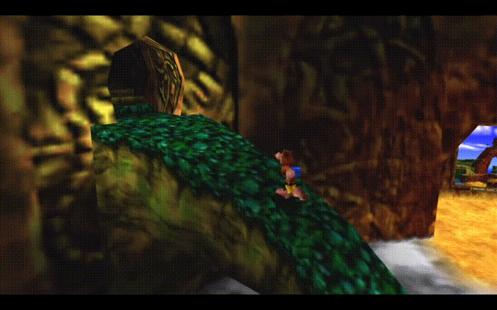
Like visual effects, I think transitions can also be a good opportunity for storytelling or adding personality to a game. One of my favorite examples of this is Banjo Kazooie, which transitions between levels using a puzzle piece shaped "iris-out" effect. For Terranova though, we kept it subdued and used a simple crossfade.
*This is a polite way of saying it was a pain in the butt to code and I cursed at my computer lots.
Keyboard Navigation and Shortcuts
One of my goals for Terranova is to make that the game is playable using only a mouse, only a keyboard, or a combination of both.
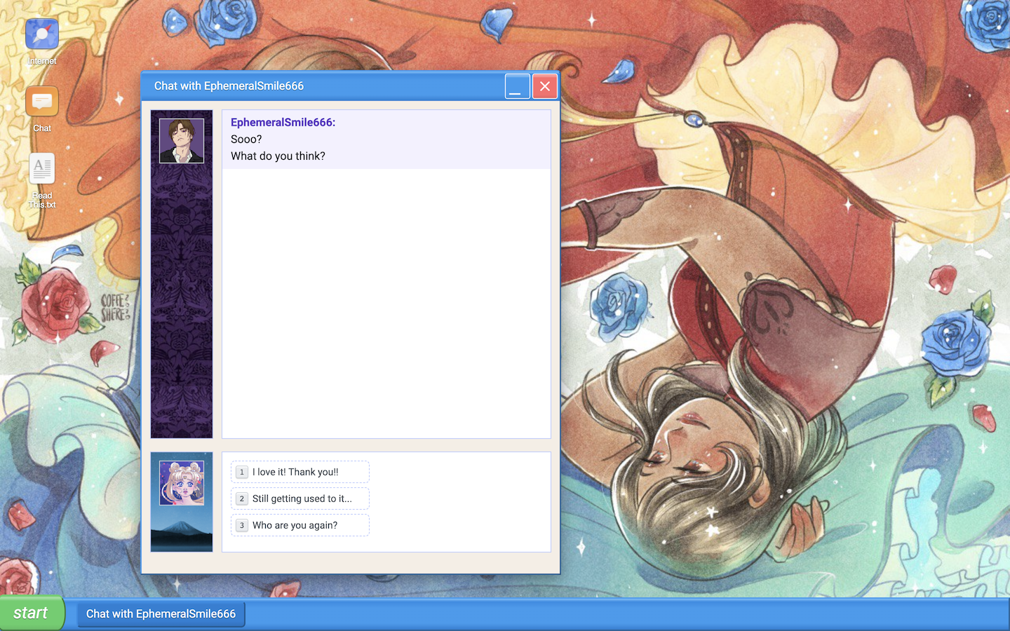
The main place you can notice this is in the chat window, where you can use the number keys to select an option, and the spacebar to type a reply.
But I've also put a lot of work into making sure the rest of the interface has sensible keyboard behavior as well, even when it's not called out in the UI with explainer text. For example, you can use the tab key to move between buttons and windows, and you can use the arrow keys to navigate lists and grids. This is one of those "invisible" features. Nobody really thinks twice about it when it's there, but if it's not, it will likely cause some players a lot of frustration.
That's all for now! Until next time, what are some of your favorite game moments recently -- what little details stood out that made the experience better? Leave us a comment here, or talk to us over on our Discord.
Your friendly devs,
CJ and Matt
Leave a comment
Log in with itch.io to leave a comment.